
Project Scope: Brand Strategy, Research, Brand Identity and Website Designing
Date: July 2019
Sector: Food and Beverage
Skinny Bakes
BRIEF: Skinny Bakes’ food is your chance to go on a guilt-free binge! As a bakery that uses high-quality and healthy ingredients to create wholesome treats, Skinny Bakes is every sweet tooth’s favourite destination. The best part? They believe that you don’t have to compromise on taste to be healthy - so their treats are as mouth-watering as they are nourishing.
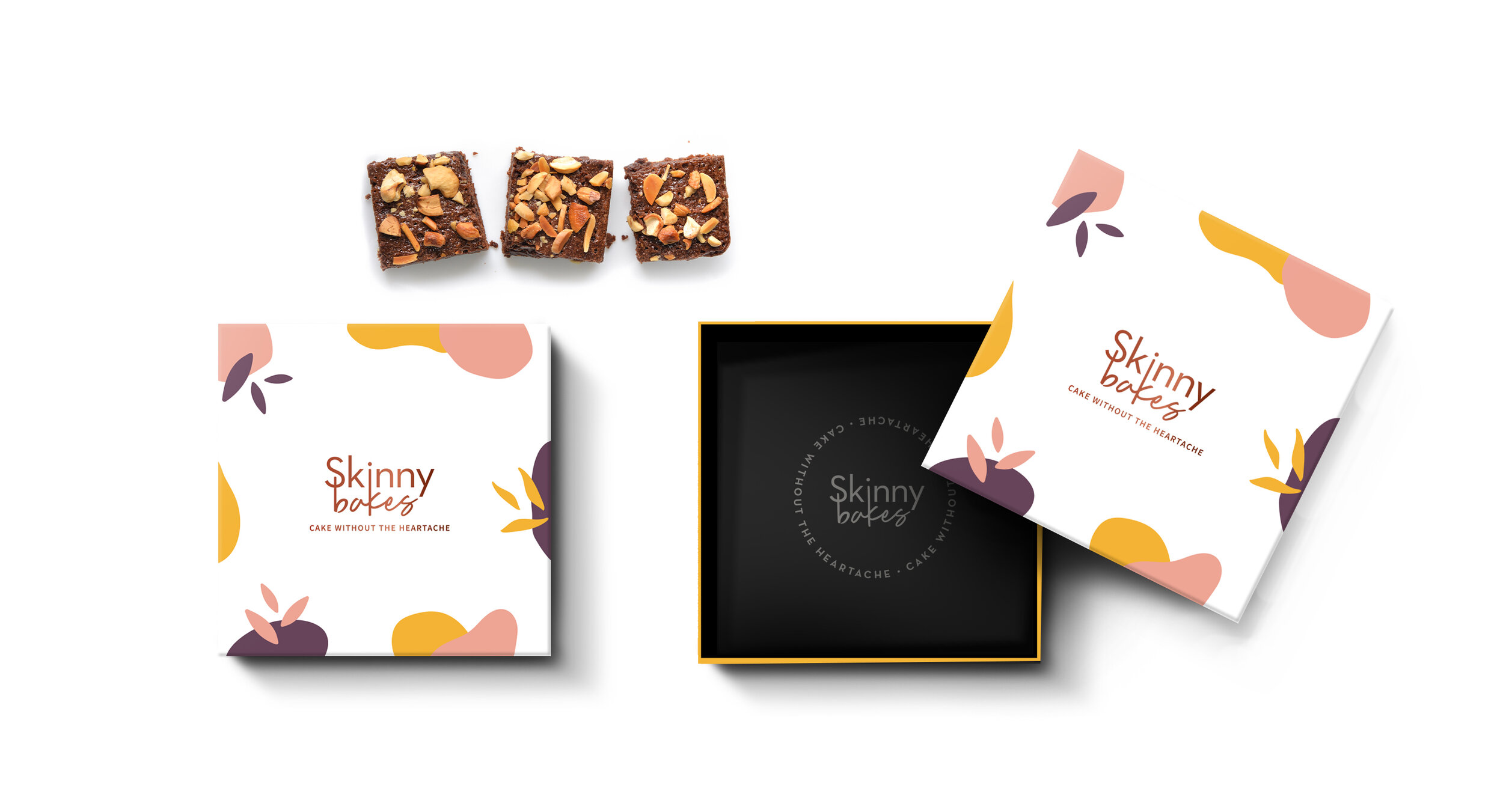
APPROACH: To start with, we developed their visual identity, packaging, and nomenclature. We used an overlap of organic shapes to highlight the artisanal quality of the products, and abstract natural elements to convey the goodness of ingredients. To keep the brand fun and playful, we came up with the tagline "Cake without the Heartache.”
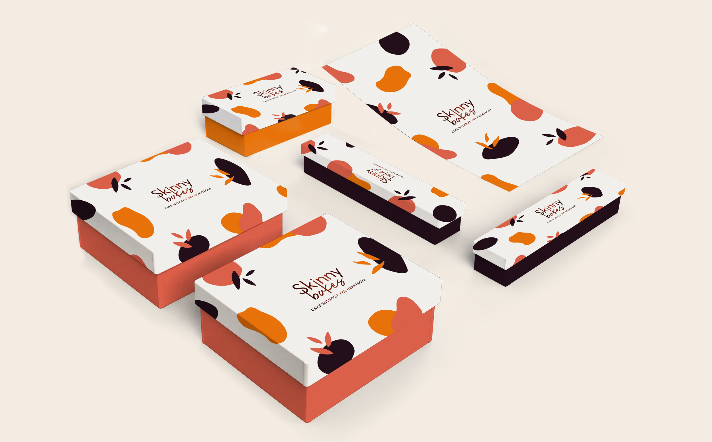
Through the logo, we wanted to demonstrate how Skinny Bakes’ desserts were healthy and delicious. We steered away from the usual pastel tones and used a warm and a bright colour palette that gave the brand an air of excitement. We also incorporated organic shapes and abstract elements to represent the natural ingredients being used in the products.
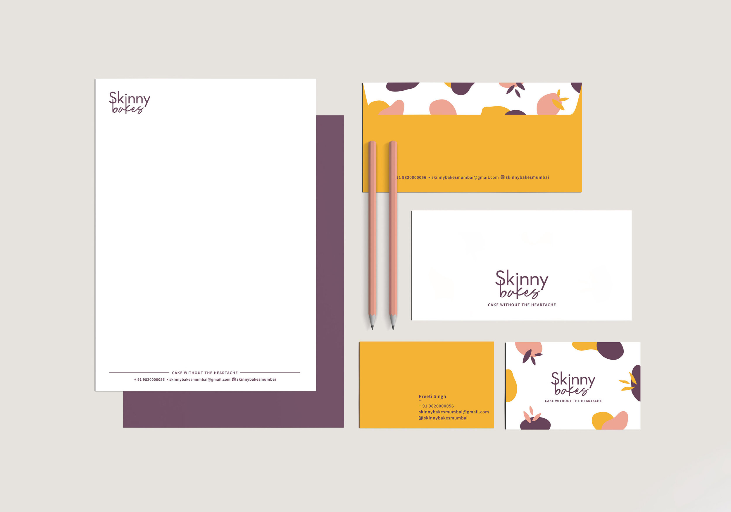
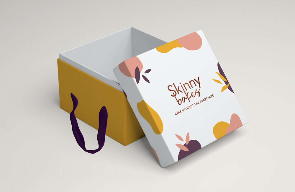
We also designed their business cards, envelopes, and letterheads using the brand pattern and colour palette. While working with three different box sizes and proportions, we ensured each box had different bottoms, and that the brand pattern was embedded with the copper foiled logo at the top.
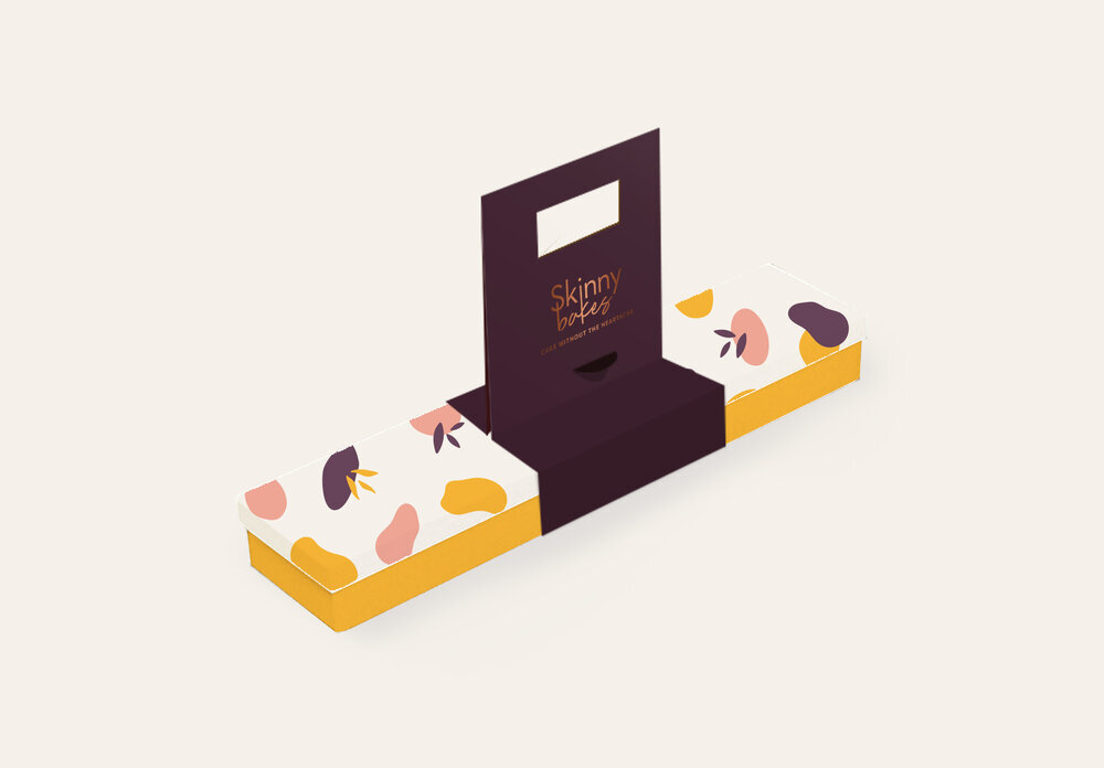
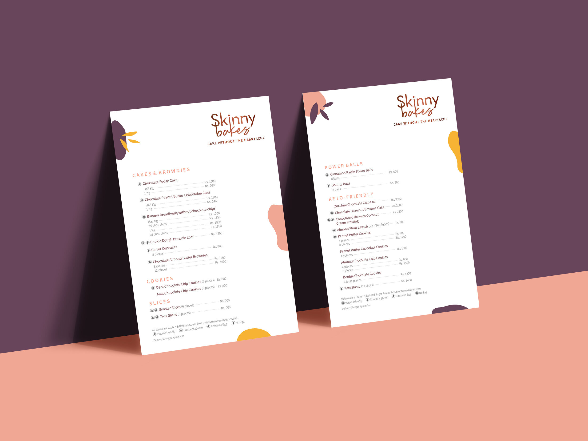
Instead of using paper bags to send single boxes, we suggested adding handles to boxes and sleeves for the long box, thus reducing the use of paper while also keeping the foods safe from tumbling and getting spoilt. We also designed bigger paper bags for when they had to send multiple boxes at once. Lastly, we designed an exciting and yet simple two page menu using the brand pattern and colour palette.

This project was designed under Studio Glyph