
Scope of work: Brand Strategy, Research, Brand Identity, Packaging and Brand Collaterals
Date: December 2021
Sector: Food & Beverage
Barosi - A Postcard From Bharat
BRIEF: Barosi is an authentic farm-to kitchen brand that provides fresh, natural & wholesome products. They are rooted in their traditions, by provide the best products from different parts of the county to your kitchen.
APPROACH: To evaluate the existing brand values, beliefs and rebrand and refresh the packaging of the products. It was important that the packaging talks about the brand essence and the USP that is where the product comes from & how it is made
Barosi is a brand that is truly good for you & filled with goodness made authentically & traditionally.
THE BRAND:
Coming from a rural background, Durlabh, the founder always wanted to have a connection with its history. Working in the urban space showed him the opportunities that can be used to create a better place for the farmers. That’s when he founded Barosi. He really wanted the Urban area to take a step back and enjoy the simple times of the rural areas with his products.
We wanted to show how different rural and urban areas are in reality. India is actually referred to as Bharat in rural India. All Barosi’s products are made in different rural parts of India that travel to the main city.
THE LOGO: The dot in the letter B (Bharat) is moving to the letter I (India), just like the products of Barosi
BRAND NAME: In the villages, mothers use to give milk right out of a clay pot when kids got back from school. This clay pot was in a Barosi - Barosi is a small dig in the ground filled with wood and cow dung cakes. That’s how the brand got its name.

It was very important to translate Barosi’s brand story appropriately to the consumers.
So when you receive a product from Barosi, it’s a postcard from different parts of India filled with anecdotes attached.
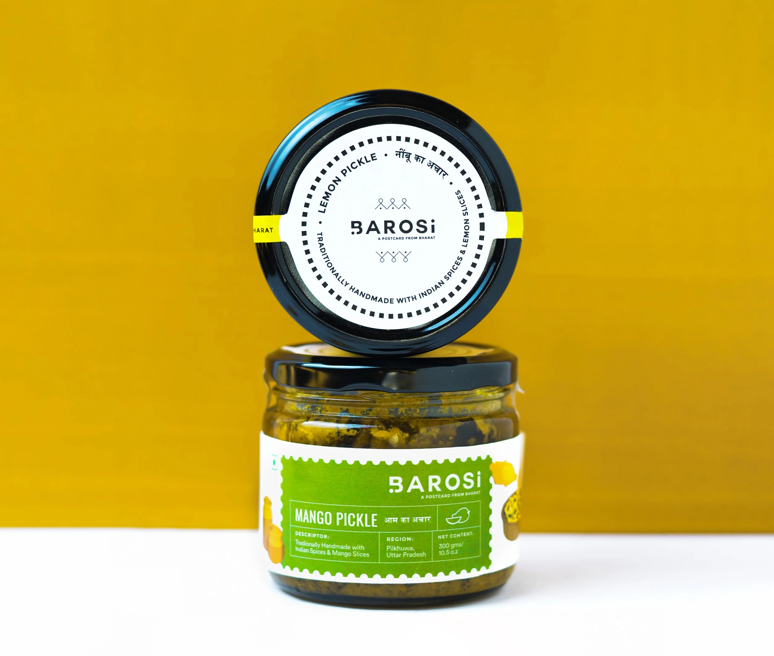
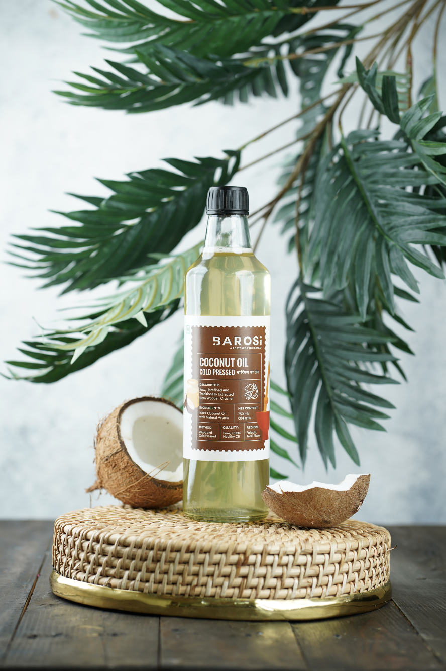
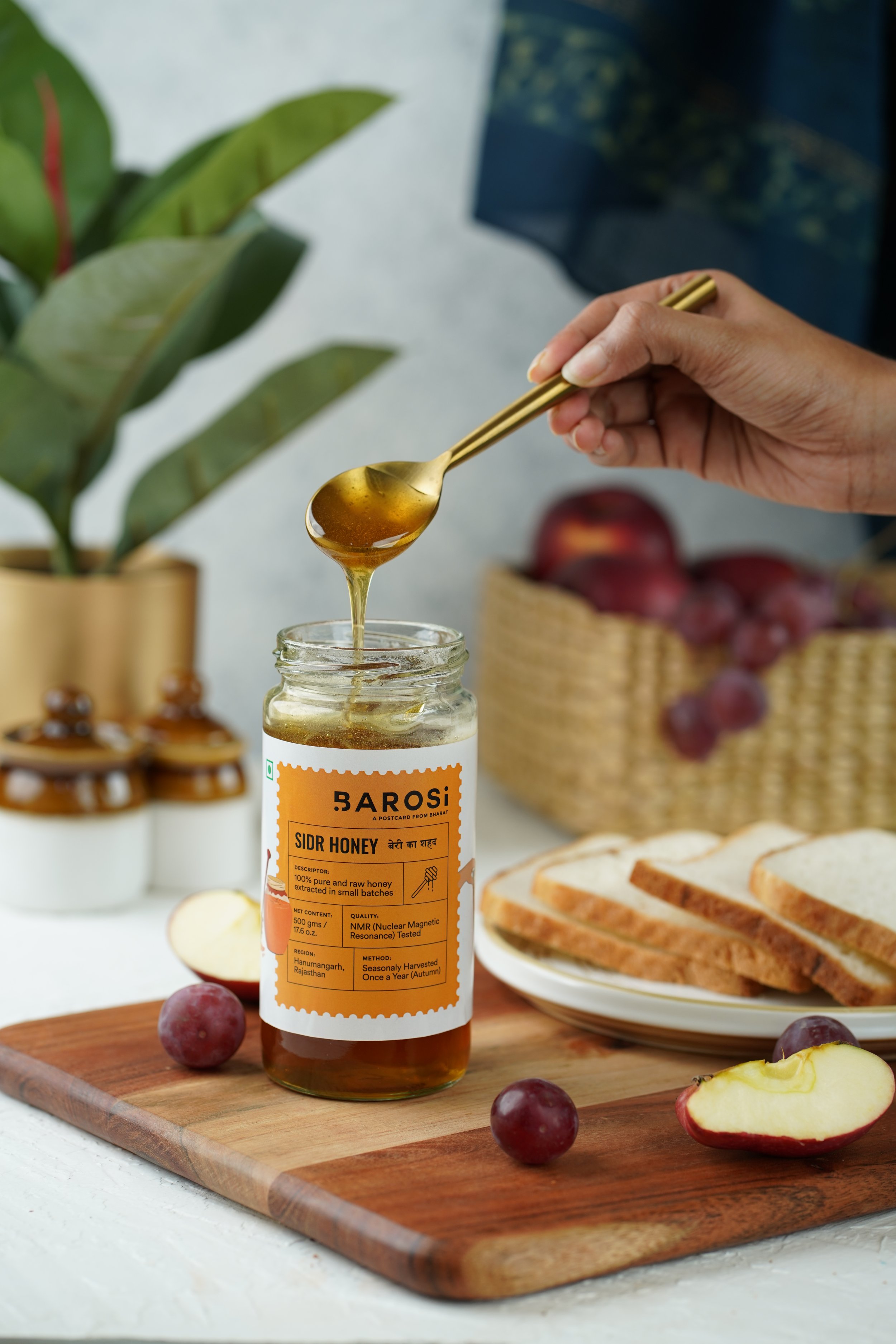
So we created strong elements like using postal stamps, label descriptors, postcards, and traditional pattern. etc.


THE PACKAGING:
A brand that is grounded in their roots, honest about its products, and straightforward about who they are deserved their story to be told. Our packaging was a mix of a detailed label with each and every detail laid out, two illustrations of the product being made & the final product, and an element that compliments the brand story.


A brand that wants its customers to understand how are the products being made, where it comes from. It was important that consumers know what’s the origin of the products.
So, on every product’s backside, we ensured to mention how the product was traditionally made and the memories that the founder has with each from, and where it comes from. For eg: Wheat comes from Ashok Nagar, Honey comes from Faridkot. etc.


SECONDARY PACKAGING: Barosi is truly a sustainable brand, the products are packed in reusable glass jars. Since the brand only has the bandwidth to do brown carton boxes, we wanted to add something more to create the experience better.
So each box has 4 different stamps - one for the origin, second for the product, third of how the product is being made, and lastly one with the product name. Each box had a different look & experience. Our goal was to create a thoughtful brand with memorable consumer experience.


Milk Van and Factory store front

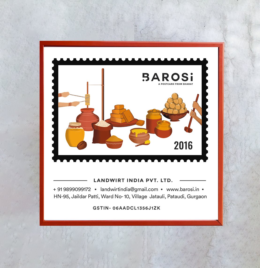
Illustration by House of Ikari | Photography by Aditi Kabra
“ After a lot of research and discussions, I decided to work with Sejal for Barosi. I am super happy that I took the right decision. What stands her out from the sea of options is her professional skilled approach, aesthetic sense, going the extra mile to achieve excellence.
I wish her the best for her future projects, keep growing!”
- Durlabh Rawat, Founder of Barosi